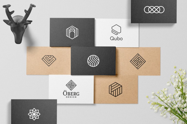
Geometric logo designs are mostly basic logo design concepts for most brands, by putting together various shapes like circles, polygons, hexagons and many more, a designer can create endless designs that are simple or complex and result in a logo. Each trendy and unique logo should come with its own meaning which resonates what the company believes in and should have its own unique characteristics.
Geometric logo designs convey the concept of the brand through their design.
If you are creating a logo through a digital medium or a digital tool, the following tips will help you with your geometric logo making skills:
Building from Basic shapes:
By keeping shapes as a foundation stone you can increase the accuracy of your design by ten folds. Circles, polygons, triangles, squares etc. build up to create appealing designs which are very helpful rather than creating a haphazard sketch. A design with shapes can be aligned well and adjusted to create a logo pattern.
Usage of overlapping elements:
Complex geometric logos begin with overlapping of basic shapes. You can practice overlapping by taking a basic shape like a circle and notice the shapes and lines that form after overlapping a number of circles together. Adobe Illustrator is great software that helps with overlapping of shapes; you can practice this method by making use of the vector tool.
Perfecting placement by rotating shapes:
Overlapping shapes will only take you halfway on the path to creating your own geometric design. Overlapping is incomplete without rotating your shape, by rotating your shape you can begin creating the design that you intended to. To rotate the shapes, the designer must make use of the vector tool in Adobe Illustrator. This will help them get the desired logo outline.

Line art and Greyscale versions are important:
Adding color to your logo can transform it, giving it a new dimension, but logos are often not printed in color. So, as a designer, you have to be prepared to see your design in color or in black and white. You can do so, by creating an alternate version to your color logo. Alternate versions can include full color, grey scale, limited color or line work, by doing so you can see how the design works in a variety of contexts and if the impact is the same in color or not.
Conclusion:
Hopefully, the above-listed suggestions will help you with your geometric logo ideas. Logos will always remain a crucial part of a company’s identity. It helps differentiate a brand and improve customer engagement and also increase respect. The world of design is constantly changing and as a designer you will have to focus on your client and their problems in order to produce the best design.

